

With web design templates everywhere and hundreds of free designs, custom websites often seem like they take more time and budget. However, it also means that you have complete control over your website. When web design is not your friend, you may notice that your site has a higher bounce rate, doesn’t convert well, or has low return traffic.
While you may not be able to change very much about a web template, a custom web design helps you arrange your most important elements and display information that your customers want to see.
So what web design mistakes should you avoid?
In our experience, websites that feature one of these should be audited and upgraded for better performance, conversion, and customer experience.
1. Old, Restrictive Searches
Predictive search is the new way to get customers on the right page when they search your site for information. However, many sites are still using older designs that do not offer corrected spellings, suggestions, or different case rules in order to match to pages.
Search is the best way that users can find products when it’s not in your navigation, so it’s important to have a search field that can easily get the customer to the right products.
2. PDF Files
Loading a PDF file is a thing of the past. Users do not want to download a PDF file that takes forever to save and print. It’s also difficult to do anything with a PDF other than read it, and while some users will still read manually through content, many want to search and find what they are looking for quickly.
3. Wall of Text
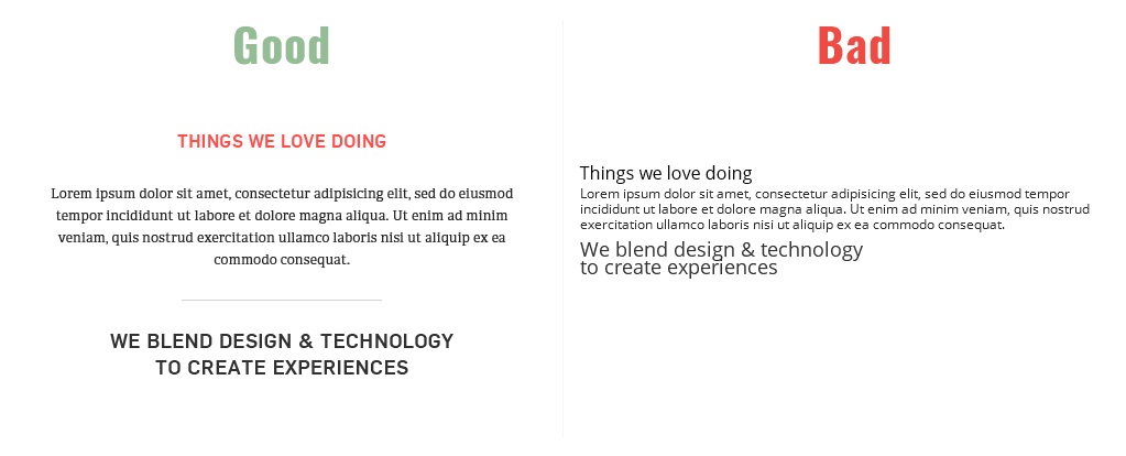
Today’s web pages need formatting for a number of reasons. However, you can design a page so that the eye slips down without getting stuck on big blocks of text. Customers look for the following:
- Subheads;
- Keywords;
- Short paragraphs;
- Bullets;
- Call-to-actions;
- Images;
- Language that isn’t fluffy.
Text has to be scannable and shareable with lots of ways to capture the user’s attention while still delivering information.
4. Changing Visited Link Colors
Links need to look different than the text as part of your user experience.
Whether you have a call-to-action button or a text link, the colors should change depending on whether you’ve hovered, clicked, or visited.
Links are an important part of the navigation process. Users may not know that a link has been clicked or may think that the site isn’t working if it doesn’t react upon click.
5. Default Fonts and Font Sizes
Have you ever browsed to a website that had a modern design but chose Times New Roman for all of their links? This is probably because you didn’t have the font that was specified in the design, and the web developer didn’t specify a default “Sans Serif” font in case of that scenario.
With Google web fonts, you can avoid these issues. Designers should be aware of fonts and font sizes in their web designs. This helps users appreciate the design of the page with appropriately sized page titles, paragraph text, and quotes.
6. Poor Messaging
Page and header titles are important to explaining the content of the page and directing customers to where you would like them to go. The page title also matters for search visibility. If you design pages with shorter, non-descriptive page titles, then you won’t be able to get seen in search listings.
7. Advertising on Your Site
Web users have stopped noticing ads, but you can direct attention selectively to parts of your website that are most important with goal-driven messaging and navigation. You can incorporate deliberate design elements that highlight your products and services the right way.
You can expect that users will skip over advertising entirely based on studies of what users pause to look at or using heat maps on your website. Here are a few things that users experience with advertising:
Banner Blind
While you may think that your banner is hard to ignore, users have been trained on where advertising is placed and what it looks like. Most users no longer acknowledge display ads.
Animation Unaware
You may think that incorporating an animation will make your ad more noticeable, but that’s also not going to work. With more blinking and flashing, users will either bounce or skip over the image entirely.
Annoying Pop-Ups
Unfortunately everyone hates pop-ups. You may be able to get away with an on-page popup that goes away easily with a click of the “x.”
8. Non-Responsive Design
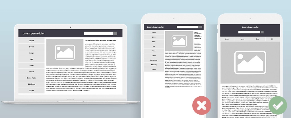
Smartphones and tablets are the new normal. If your site can’t be viewed on a smaller screen, then you may lose tons of traffic. In fact, there are over 876 million websites that have responsive web design now. It may be time to revamp your design if it doesn’t resize for different screens.
Web designers who create layouts with lots of elements should also create compatible mobile designs to help the developer place elements and creative responsive pages.
9. Relying on Website Builders
You may have purchased a template with a website drag and drop builder that looks easy to use. However, you should still have a web design look at the page with you to decide where and how to place objects. You don’t want to create a design that is all blocks and texts. You can also create a lot of errors and speed problems if you place too many elements.
10. Poorly Designed Forms
A form is a great tool to acquire subscribers and bring in return customers. You can capture information on any page using a form in the sidebar or header. You could even call out to it on the bottom of the page. You also want to make sure that your form is responsive and uses validation.
Forms that convert well typically have 2 to 3 fields with a call-to-action button.
People are more apt to give up their name and email address, but are more reluctant to enter an address or phone number.
You may be able to collect more information if you explain the reasoning. For example, asking for a birthday because you offer discounts is a good way to collect age information about your leads.
11. Hidden Navigation Structure
Today’s navigation has to be simple. If you have too many elements or links under each category, it may get lost. Instead, simple navigation with quick links that can be clicked and used to navigate to pages that have their own sections are best. You can also use mega menus for desktop websites, but mega menus may not work well for responsible mobile design.
12. Poor First Impression
Did you know that once your page loads, users form an opinion in .05 seconds? This means that your homepage or landing page should be able to convey what it is that your company does or what your product does quickly. This allows the customer to understand whether they should choose you.
You can also include some trust-building designs such as security icons, testimonials, awards, industry affiliations, certifications, and terms of service links.
13. Slow Loading Time
Did your web designer use a lot of high-definition videos and images in the design? Do you have a slider that loads something new each time it swipes? These are issues that will slow down your website. While you should want a modern design, you should also want a design that is optimized for speed.
Your designer should know that constraints of page speed and find ways around that to design a page that will load within 1 to 3 seconds. You can use Google Page Speed test to see what elements are taking up the most load time. Designers may need to look at ways to reduce images and use vector designs when they are creating animations.
14. Social Media Icons
Social media is very important for multiple reasons, but the main reason is that users can share content that they find on your site just by clicking on icon. However, your design shouldn’t feature the social icons too prominently. Here are some areas where it is best to have share icons:
Bottom of the Page
This is in your footer content. You can line up the social media icons at the bottom along with important information about your company and links to different pages.
On the Product Page
This is a great way to have products and services shared to a specific page by users.
Contact Page
If you want your users to reach out to on social media, then you should link to the support social sites that are active and will reply promptly to your users. Many companies use Facebook and Twitter for their support.
15. No Contact Information
Your contact information is an important piece to help service customers. You may want to feature a phone number or email at the top or link to a contact page. Having a professional email address has endless benefits to your brand or business and it can be set up in as little as five minutes for free.
Your contact page design should feature phone numbers, email, chat links, and a map if you want the customer to be able to find your location. You may also need a store locator widget to ensure that your visitors can find physical storefronts nearby.
There are a few things that web designers have to follow just to keep to the design standards. Every homepage should have a contact button or a way to contact the company. You may also want to have a copyright statement at the bottom of the page with a privacy policy and terms of service.
16. Inconsistent User Experience
Creativity is great, and your web designs should be an inspiration for those to engage. However, excessive creativity can create a confusing mess that doesn’t allow your users to find what they are looking for without having to get around animated elements and pop-ups that block other elements.
You should use a consistent design for each page that links to related pages and features the same form if you are trying to acquire customers.
17. No White Space
If every part of your website is cluttered with images and texts, it will be more difficult to call out the important pieces that matter. Whitespace has its own creative uses and highlights exactly what you want your readers to see.
18. No Background Music

If you have ever been to a website that loads slow and automatically starts playing videos or music, then you know how annoying it can be to turn off, especially when you are trying to browse quietly. It’s important to feature elements without going overboard with sound elements.
Conclusion
You can build a website that is responsive and creative without going overboard. It’s important to keep it simple and always look at your website through the lens of your visitors. You can also use tools like HotJar to learn more about what users are looking at and clicking on.
These are important parts to creating designs that convert better. While you may think placing a form in a certain area is best, you may be surprised to find that users skip over a form if it is placed on the left of the page verses the right.
You should also test your site over and over with different landing pages and user experiences to see what works. You should also test the site on different browsers and mobile phones. This will let you know what else you need to change in order for it to be responsive.

Get a Custom Solution with Web Design Sun
At Web Design Sun, we specialize in building web applications for clients in every business and industry. If you’re interested in custom applications for your business, contact us today.
Contact us today to get started