

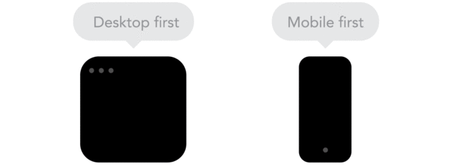
Mobile-first indexing refers to Google’s new approach to indexing and ranking content on mobile sites. Once considered an afterthought to desktop sites, mobile websites have risen in importance and validity. Today, Google indexes and ranks them the same way it used to index and rank desktop sites before.
We’re in a mobile era. It’s taken not that much time for mobile searches to overtake the number of desktop searches, and it still grows. That’s why it makes sense for Google to index and rank content based on mobile pages. In reality, more people will see content on mobile versions than they will on desktop versions.
Are you ready for a mobile-first strategy?
First, it’s not an option. You can’t switch it on or off on your site. You can’t choose when and where you want it.
Second, you don’t want to miss out. Mobile-first indexing is an approach to crawling and indexing. Not all search engines use it. Bing, for instance, doesn’t crawl mobile websites. But, we all know that what we want most is to rank high on Google searches.
The Deadline For Mobile-First Is Here
Mobile-first indexing is happening now. By the end of March 2021, you won’t have an excuse to be unprepared. If you aren’t ready, you might be left behind. That’s why it’s important to understand the power of mobile-first design and its influence on web development and SEO ranking.
In this guide, we’ll explain the importance of this new indexing, how it influences web development and how it affects your bottom line.
It’s Been in the Works
The transition to mobile-first development has been in the works for some time. Google began talking about it and preparing for it in November 2016. Since then, Google has made it clear that the rollout to a mobile-first strategy is underway.
In 2018, Google began fully indexing the first mobile sites. Since then, the index crawlers have reached more sites. Google plans to switch from mobile-first to fully mobile-only by March 2021.
Here’s a more detailed timeline.
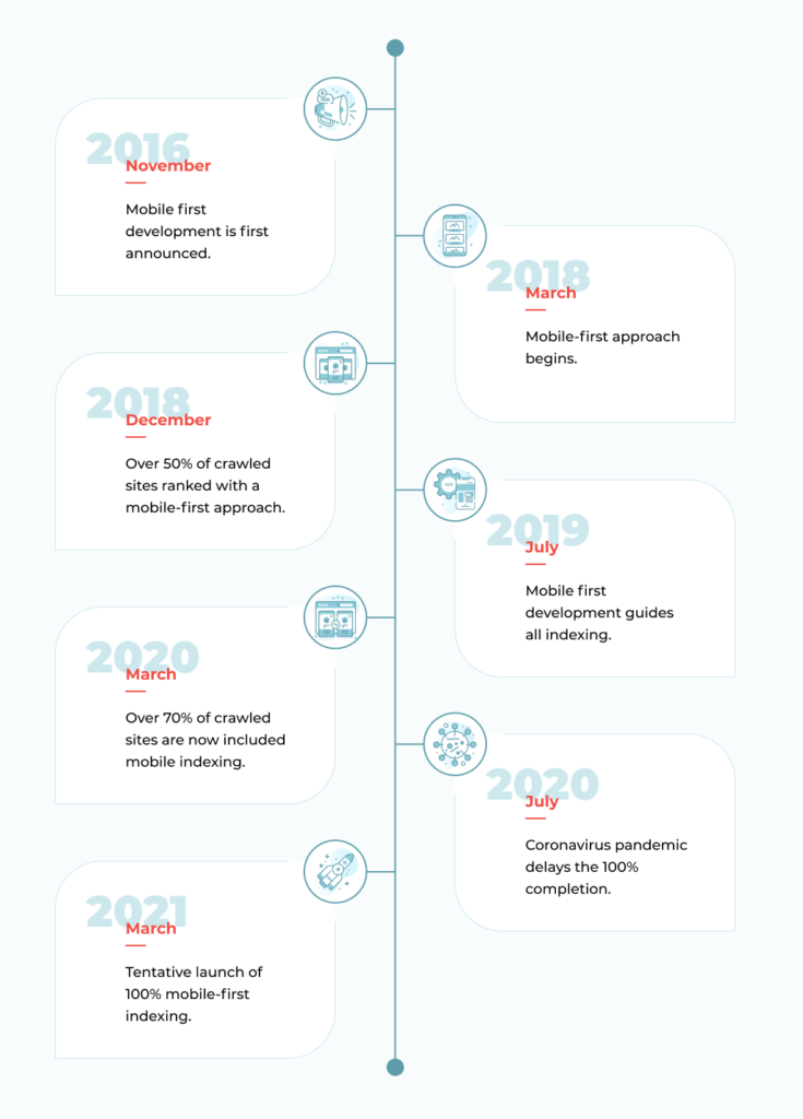
It’s 2021, and there are no more excuses. We need to include mobile first development in every website design.
What Google Says About the Rollout
Google’s revised mobile-first indexing deadline is on its way. That’s when your website will need a new mobile first design.
John Mueller of Google said March 2021 is an approximate deadline, and
“That’s approximately the target. We don’t have a critical reason to reach any particular cutoff date, so it could be that the remaining sites are a bit spread out, some earlier, some a little bit later.”
How To Prepare for Mobile-First Indexing
Let’s clarify one key point.
Google won’t have separate indexes. It won’t use one for mobile sites and one for desktop sites. SEO rankings, search results, and more will all come under the new approach.
What does this mean for you?
If you haven’t optimized the mobile version of your website, content on your site won’t count after Google makes the switch. Ignoring your mobile site means being ignored by the crawlers and the Googlebots.
This isn’t usually a big problem for responsive sites, but it can be an issue for complex websites or those using the old m-dot sites (for instance, m.website.com).
What do you need to make the transition to a mobile-first strategy? We’ve identified some key points that need your careful attention.
Technical Checks
It’s not enough to just optimize your site for mobile-first indexing. When you meet with a website designer or developer, you should be sure they understand Google’s technical requirements. A mobile first strategy is a smart approach to website design, but you also need to make sure your site meets those requirements.
You can read about them in more detail here.
If your site moves to mobile indexing without fixing those technical issues, you can easily lose your rankings. A mobile-first strategy involves specific input from engineers and technicians.
First of all Mobile-first approach from the code side is in creating CSS in such a way that first of all will be loading mobile versions from the smallest sizes to mobile of bigger sizes, then tablets versions, after that comes laptops sizes, desktops sizes, and in the end 4K. So it means that developers think about how to build the CSS side.
Your developers should have a solid CSS strategy in place before they begin building the website. They’ll have a plan in place to allow loading of your website pages into any device.
Make Page Speed a Priority
No one wants to browse a slow web page. In fact, users continue to want faster websites, and the speed of a site continues to be an important ranking factor.
Google’s Gary Illyes confirmed this during a session about mobile-first at SMX in 2017, where he explained how Google incorporates speed into its mobile-first indexing. In reality, a fast site may not boost your rankings much, but a slow site will drag your rankings down.
A slow page can increase your bounce rates and lessen the time people spend on your site. It can also lead to lower conversion rates, slow down loading times and affect many other areas.
A slow site is slow death for your website. Make speed a priority.
At the same time, keep the user experience front and center.
Handling Separate Mobile and Desktop Sites
Last but not least, it’s important to know how to manage mobile-first indexing when you have separate mobile and desktop sites. This situation has become less common because of the rise in responsive sites, but it hasn’t gone away. There are still websites that operate entirely separate mobile and desktop versions.
How do you manage them in a way that optimizes your SEO and your mobile-first indexing?
Here’s what we recommend:
- Keep rel=canonical and rel=alternate elements on both the mobile and desktop versions of your site.
- Make sure the robots.txt file on both versions allows every part of your website to be crawled. In particular, be sure your mobile site is not blocking crawlers from its key elements.
- Carefully check rel=hreflang implementation to make sure that your desktop URLs click to other desktop URLs and mobile URLs click to mobile URLs.
- Verify both versions of your site on the Google Search Console to ensure you’re allowing full access to all your data, warnings and messages.
- Double-check that your desktop site’s pages have corresponding mobile pages. Some websites leave certain pages out of the mobile version. Doing this means leaving those pages out of Google’s mobile-first indexing. Your aim should be to leave nothing out.
Always Provide the Same Experience Across Platforms
Many designers have developed a singular focus on a website’s mobile UX. That’s great. A strong mobile UX helps you reach the vast audience of mobile users.
You can create problems, however, if you do this by hiding a lot of desktop elements. Doing this may seem like the obvious solution to creating a mobile-friendly experience, but it can damage your mobile-first indexing.
A Warning from Google
In fact, Google advises always providing the same experience across all platforms. Don’t leave anything out, especially content.
Google’s mobile-first indexing guidelines clearly state:
“If your mobile site has less content than your desktop site, consider updating your mobile site so that its primary content is equivalent to your desktop site. Almost all indexing on your site comes from the mobile site.”
It can’t get much clearer than that.
But just in case you still missed it, Google adds the following:

What’s the bottom line? If your designers choose to improve mobile usability by removing content, you will see losses in traffic.
What’s the Solution?
We recommend displaying content in a mobile-friendly way rather than hiding or removing it. Doing this successfully involves talking to all stakeholders involved in the website to explain why it’s crucial to maximize mobile-first experiences without sacrificing content or traffic. It can be done, and we can show you how.
The importance of content and traffic can’t be overstated. Your website’s strategy team must make SEO techniques a priority from day one. Waiting until the site launches is too late.
This is where design, content and engineering all come together to achieve the same goal. The whole team should be on board with the goals of maximizing traffic and optimizing SEO results for the website.
Mobile First Design Best Practices
A mobile first design should have optimized text sizes, tap targets, padding and other elements. Make sure your site has the right balance of these design elements. You can check Google’s guidelines by looking for “Enhancements>Mobility” on the Google Search Console.
You can get more details from this Google-penned article with even more mobile-first indexing best practices that’s also worth checking out.
Why do we emphasize meeting Google’s requirements and suggestions? If your website isn’t optimized for Google searches, you won’t get the rankings you want.
Content Is Key, But These Elements Also Matter
Content matters, but it’s not the only thing that boosts SEO.
Other elements of your website should also be the same across all platforms. They include:
- Structured data.
- Metadata.
- Meta robots tags.
- Ad placement.
- Images and videos.
Keep these elements identical across mobile and desktop devices. Not doing so will cause lost traffic and lower SEO rankings.
Pop-ups, Interstitials and Ads
Run a visual check to make sure you don’t have too many interstitials and ads on your site. Google’s guidelines can tell you how to incorporate these elements into a mobile-first strategy.
Navigation and Links
It’s important to maintain strong external and internal links. If you maintain your canonical tags, your external navigation links should consolidate properly and be counted in your mobile pages.
Internal links are also important. Be sure to retain all the important ones on your mobile version. For instance, maybe you left out specific elements to save space on a mobile site, like breadcrumbs. When Google begins navigating your site with PageRank, the loss of those elements can affect the way the indexing flows through your site. Leaving out key internal links can cause your page ranking to drop.
Don’t Confuse Mobile-First Indexing with Mobile Usability
Mobile-first indexing and mobile usability are not the same thing. Do you understand the difference? Does your website team?
Your website may be low on mobile usability but still have high rankings because of its strong mobile-first indexing.
As Google’s John Mueller has explained:
“A site can or cannot be usable from a mobile point of view, but it can still contain all of the content that we need for mobile-first indexing. As an extreme example, if you take something like a PDF file that is on mobile, that would be terrible to navigate. The links will be hard to click, and the text will be hard to read. But all of the text is still there, and we could perfectly index that with mobile-first indexing.”
What does this mean? It means those smartphone Googlebots can find your content and other content that isn’t particularly mobile-friendly. The bots can use that content to rank a mobile site on the search engine results.
But that doesn’t mean the site is well-designed, and it doesn’t mean you’ll keep that high ranking. Your site can still lose users and drop in the rankings if it doesn’t provide a good user experience.
What’s the User Experience on Your Site?
Is your mobile site easy to use? Is it attractive and informative? If you’re hiding elements or otherwise making your mobile site an inferior experience, you will lose customers. They’ll go to another site that offers a more enjoyable, content-rich experience.
Here’s what we tell our customers. It’s a simple rule:
Optimize for your users, not just for the Googlebots.
Focus on creating an amazing experience for your site’s users while also taking Google’s algorithms into account. Do this, and you’ll achieve a great-looking site across all platforms while getting great SEO results.
Mobile-First vs. Responsive Technique
Is mobile first design better than responsive design?
There’s a debate about which design is better, but the debate is kind of pointless. Mobile-first design is less about design than it is about strategic planning. Responsive design is specifically a design technique. You shouldn’t have to choose between one or the other. You should choose a website design that combines both.
It’s meaningless to compare mobile-first with responsive design or adaptive design. When we create a website with a mobile-first approach, we choose a strategy that places more attention on the mobile view. We create a website that will perform equally well on a small mobile site as it does on a larger desktop version.
How a Mobile-First Approach Affects Your Budget
Most of our clients are just waking up to the necessity for mobile-first indexing.
We’re actually in the midst of rebuilding our own website to be ready for the mobile-first rollout. On that subject, we’ve learned a lot of life and website hacks that we’re happy to share.
Now, let’s talk about money. If you’re like most of our clients, you want to know how a mobile first strategy affects your bottom line.
What Affects the Price of Mobile First Design?
We can’t give you hard and fast numbers right now, but we can point out some factors that affect the price of website design and development. Here are the chief ones.
Do you already have a mobile design? You may already have a site that’s optimized for mobile viewing. Many responsive, mobile-friendly sites were created without genuine, thoughtful mobile-first design. Most front-end developers can make a website that looks great but lacks some key elements. We have to add in those elements that make it mobile-friendly.
If you have an existing mobile design, we’ll have to change it to incorporate more mobile-first elements and technical keys that fit Google’s mobile-friendly requirements. You will need an overhaul of the design, and that will add to the cost.
How is your user experience? Earlier, we explained that user experience is critical to mobile first development. Our designers can create a website that attracts and keeps users. We’ll create a new strategy focused on the mobile user experience and interface. This also adds time and money to the project.
How quickly does your website load? Proper front-end development means creating a website whose objects load smoothly and quickly. Speed is an important part of any mobile-first website. A mobile first strategy will give you the speed and usability that push your site high on the Google rankings.
A new focus on mobile-first design means a new focus on your site’s functionality and interfaces. We’ll be sure to optimize these to achieve the best results possible in your SEO ranking. It also requires getting used to thinking about websites in a whole new way.
Final Thoughts
Hopefully, you are already incorporating mobile-first indexing into your website design and have no reason to worry about the upcoming Google deadline. If not, get ready while you still have time. Mobile is the new normal, and it’s here to stay. Make sure your site is ready.

Get a Custom Solution with Web Design Sun
At Web Design Sun, we specialize in building web applications for clients in every business and industry. If you’re interested in custom applications for your business, contact us today.
Contact us today to get started