
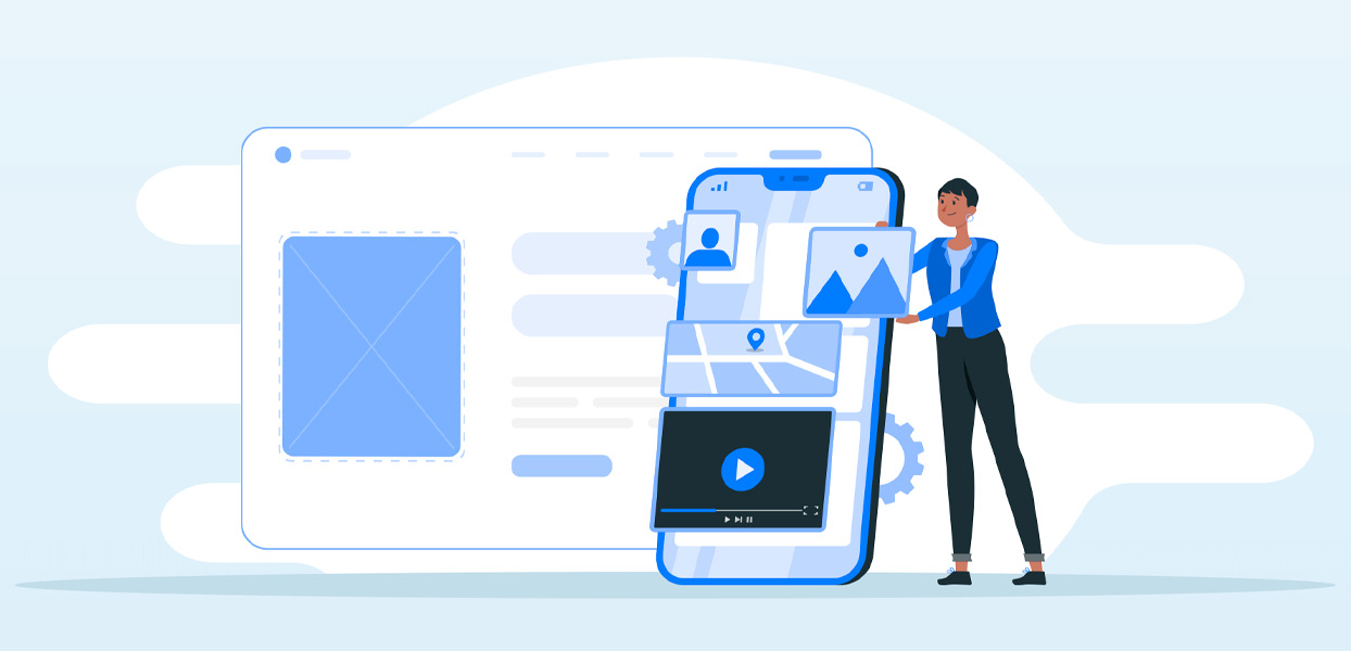
The internet now connects 4.66 billion people worldwide. That’s more than 59% of the world’s total population. That’s not even the most amazing number. The really stunning one reflects the surge in mobile users across the internet. Out of those 4.6 billion, 4.28 billion are connected on mobile platforms. That number should bring home how vital mobile users are and why mobile-first design should be your priority.
That number shouldn’t surprise anyone who was watching. The sale of mobile devices has far outstripped sales of desktop computers and tablets.
We’re Prepared for the Mobile-First Design Challenge
As web developers, we’ve been ready for the move to mobile-first design. Over the past years, we have shifted our design methodologies and development strategies to take the needs of mobile users into account.
Our most recent design paradigms are a testament to our commitment to mobile users. This is a challenge we’ve embraced willingly as an opportunity to grow our business by responding to what users need.
In bringing this strategy to fruition, we have focused on mobile users and their interests. In this article, we’ll explore that strategy in more detail to show you how we’ve risen to the challenge of a new mobile-first world.
What Is Mobile-First Design?
It is the process of planning and developing a website that puts the needs of mobile users first. Until now, website design has been primarily desktop-first. Today, website developers need to shift that focus to respond to the huge global demand in mobile internet users. Mobile-first design is a part of a shift in how we think about website design.
Basic mobile-first design is also known as progressive advancement in design. This involves a stripped-down version of the desktop site. It comprises a few necessary elements from the webpage in a minimalist design that eliminates everything the mobile user doesn’t want.
From there, we can add more elements and gradually increase the complexity of the design. It’s important to do this without abandoning the slimmed-down design techniques or the mobile-friendliness of the site. We continue adding depth and content until we’ve included everything that makes the desktop page work.
Starting with Mobile Users’ Needs in Mind
Today’s design initiatives don’t start with a desktop site. Instead of starting from a desktop design and removing elements, mobile-first design starts with an understanding of the mobile user’s needs.
If you want to stay visible on the internet, your site has to appeal to users who create more than 52% of all internet traffic today. A mobile-first website can help increase engagement and make your site visible on Google searches.
Google has responded to the massive increase in mobile users by changing its search algorithms to make mobile users a priority. In 2021, Google will switch almost fully to what it calls mobile-first indexing for its search crawlers.
Mobile-First Design Is Not Complicated
Mobile-first design is not a complex task. It is a series of small development changes that can help your website look great on a mobile site and, most important, fully engage mobile users. How do you design and develop a website like that? We do it by taking a shift in viewpoint, adding some twists to the design, and testing our application.
Is Mobile-First the Same as Mobile Responsive?
The short answer is no.
Mobile-first is a design method. When we use a mobile-first approach, we develop a web application specifically for mobile users. We start with a basic design and gradually add more complexity and more features.
Mobile-first design is not a development technique. It’s a design strategy that drives the development side. The developers get a clear objective and work with a defined design.
Mobile responsiveness measures how well a site adjusts itself to the size and shape of a small mobile screen. If the site reduces itself proportionally and is easy to read, it’s considered mobile-responsive.
A site that is clunky and hard to use in its mobile format is a site that’s not mobile-responsive. Mobile responsiveness doesn’t take the quality of content into account. It only considers whether the design and layout fit properly on a smaller device.
But You Need a Responsive Site
That said, a mobile-responsive site is part of your mobile-first design strategy. Your website design must be responsive. In the early days of mobile-first design, responsive websites were a smart strategy because there were comparatively few mobile users.
For those few users, a simple, responsive design that simply shrunk the desktop website down was enough. Today, it’s not enough. If you want to reach those 4 billion and counting users, you need a design that puts their needs first.
How To Develop a Website with Mobile-First Design
We view design and development as a journey. The journey to a mobile-friendly website involves several stages. Here’s what to expect along the way.
Wireframing
How important is a wireframe? It’s comparable to the blueprint when you’re constructing a new building.
The wireframe provides the architectural framework for everything you’re going to build. It is a high-level guide for technicians, artists, developers, and non-technical experts. With wireframes, everyone looking at the project can answer the question that reads, in laypeople’s terms, “What will the website look like?”
While clients and analysts can tick off their checklist of requirements, developers can see how the elements will be laid down on the application.
In a KPMG research paper titled Unsuccessful Information Technology Projects, the authors pointed to poor project planning as a chief reason for project failure. With a solid wireframe in place, you can be sure you’re laying the groundwork for proper planning.
There is another good reason to use wireframes. They increase the efficiency of the developers because they lay out clear objectives. Like behavior-driven development (BDD) and test-driven development (TDD), wireframes provide software development and management teams with shared tools and a shared process.
Responsiveness
A responsive framework is a crucial step in mobile-first design development.
A responsive website adjusts itself to a new environment with varied screen sizes, platforms, or orientations. Unlike desktops and many tablets, mobile devices do not have standard screen sizes in the market.
It can be overwhelming to consider the huge variations in mobile screen sizes and capabilities of all the mobile devices out there. How will media queries or meta tags work? Is a generic approach the only solution?
It’s important to remember that responsiveness is more than adjusting screen size or orientation, however. It also refers to the user’s experience.
For example, images are an important part of any web page. Even a user who skims the content will glance at an image at least once. For that reason, your images need to render perfectly in a mobile-first design. If it’s the only thing the user looks at, it needs to be perfect.
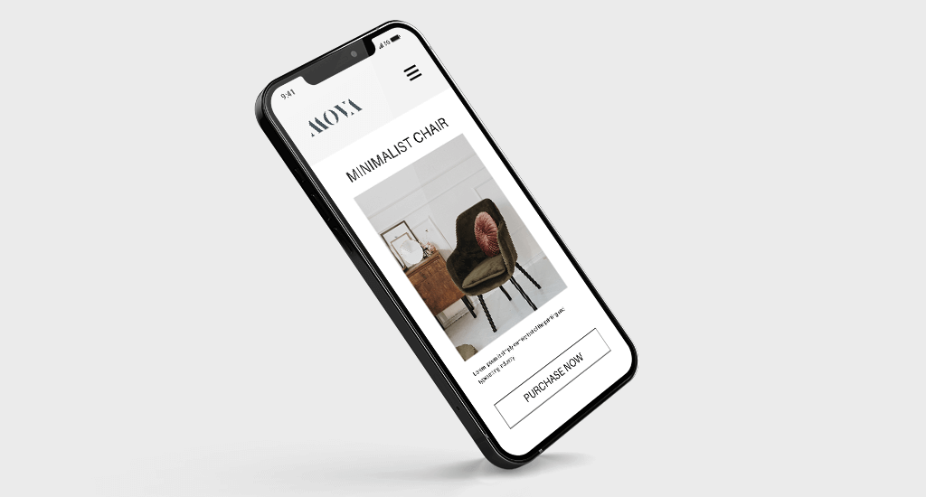
Unfortunately, designers forget this. They shrink the aspect ratio of the webpage, and this causes the image to go out of focus, crop important information or disappear entirely. Here’s an example showing how the image loses the main point of the picture when the website appears on a mobile site.
Simple Resizing Is Risky
What does this mean for your mobile-first design? Counting on simple resizing is a risky business. In this example, do we want the image to focus on the chair or the wall? Which is of value to the user?

As you can see, a well-designed, truly responsive website crops the unnecessary information, which is the wall, to focus on leaving in the chair’s picture, which is the important image. This is what we mean by a truly responsive nature. It takes the user’s needs into account.

A responsive framework keeps the users’ needs in mind. It has the built-in ability to enhance the responsiveness of each element of the website. With a responsive framework, developers don’t have to focus on little details. They can focus on delivering the elements of the website that most enhance the user experience.
Responsive frameworks are key to any successful mobile-first design strategy.
Don’t Forget About The Thumb Rule
Before placing our content on the web page, we have to determine the best location for each element regarding mobile users’ habits. One consistent habit shared by many mobile users is that they tend to use their phones with one hand.
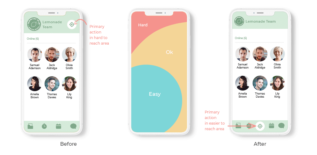
Surveys find 75% of people use their thumb to operate their mobile devices. The typical movement of a thumb on mobile is shown below in the area painted as red and green zones:
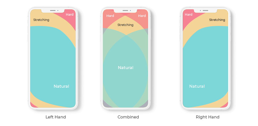
The green zone in the above image shows areas that are easily accessible on a mobile screen. Our most important elements, such as calls to action, should reside in the green zone. Putting important information in the red zone creates a frustrating experience for users. Remember, the user is not using a mouse.
This small change can greatly increase user engagement while demanding little to no effort from the user. It’s a win-win for you and your customers.
Mobile-First vs. Mobile-Friendly
This design is definitely mobile-friendly, but it is not an example of a mobile-first design. To go from this stripped-down design to a desktop design, we would have to extend this page and add elements.
Minimalism works for a desktop design because it’s easy to read, but a desktop web page requires more content. It provides a clean slate to add more sophisticated elements and richer content.
Move from Basic To Advanced – Not Vice Versa
Decluttering our design and content reminds us that’s it’s important to move from a basic to an advanced design and not vice versa. Stripping a website down, going from advanced to basic, is also known as “graceful degradation.” It’s harder to design websites this way.
Going from basic or minimalist to advanced is easier. It also produces better results.
Why is that? If you start with a desktop design, your team has to start with brainstorming sessions to come up with enough material to fill a large screen. They would then have to remove elements one by one to make the website work on a mobile screen.
Trying to shrink content and images to mobile size can be very complicated. It’s a great deal of work that produces less than ideal results.
Always start with a basic, minimalist design and then build it out for a desktop version. That’s the essence of mobile-first design.
Untangle Your Mobile First Content and Design
Designing a desktop-style web page means you don’t have to pay special attention to the content. The screen is large, and it can accommodate all the content you wish to add.
This approach won’t work in a mobile first design. With a small screen, you have less than 15 seconds to impress a user. To do that, your content must be concise and to the point. One solution is to replace content with images, use a hierarchical method of design or design a better user interface.
A smaller screen size means thinking the same way about all the elements of the website. Trying to cram everything onto a small screen will create a cluttered, congested screen view. It’s confusing and hard to navigate. A user is likely to bounce away from the site without conversion.
Design that strips down the website to its most important elements is known as a minimalistic approach (or minimalism) in web design. In a minimalistic approach, you distribute only a few choice elements on the screen and leave a considerable amount of white space. This makes it easy and enjoyable for the user to navigate the screen.
The following image shows a minimalistic design:
Prioritize UI and UX
A mobile-first design must revolve around mobile users. The goal is to increase engagement, enhance the user interface (UI) and create conversions. Think carefully about which elements achieve the desired results. Animations and transitions may be great to look at, but are they enough?
The user experience (UX) is more than explicit elements. To create a positive UI and UX, it should be easy for users to find specific elements on the site. A mobile user should never the search button, call to action, navigation bar or other important elements.
Prioritize the UX by enlarging touch targets for easy interaction.
Always think about how mobile users operate their devices. Unlike a desktop with a small pointed arrow, for instance, we touch mobile screens with our thumbs, which require a large area. A mobile-first design encourages large, clickable elements. Ample white space makes these elements easy to find and prevents unwanted clicks.
Choose the Right Font Size and Other Elements
Some websites already show mobile-first elements on their desktop sites. These sites have mobile-friendly UI and UX, including large buttons, large font sizes and directional guides.
It’s important to balance a desire for large elements with the capabilities of a smaller screen. Use media queries and the following chart to decide which size works for each particular scenario:
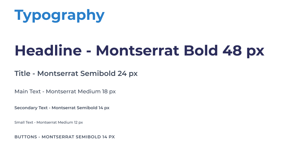
Remember, your choice of font also affects the font’s visibility and readability on a mobile device. Before you launch your site, test it for readability. Use the above chart as a reference guide.
Tip: Avoid hover-only elements on your mobile-first web page. Hovering is a great tool on desktops, but mobile devices don’t have any support for hovering. Mobile devices use touch interaction. You can keep the hover design if you turn it into a touch element. Otherwise, leave it out.
CTA Placement Matters
Call to action (CTA) is one of the most important buttons on your web page. It’s crucial to conversion goals. Every business wants a CTA that requires one quick, easy click that leads to an instant conversion.
Pay close attention to the location and type of CTA you put on your mobile site. Don’t make the user work too hard to buy from you.
Place your CTA in reach of the thumb. Remember the green zone? That’s where you want it to be. It should also be on the first presented screen and above the fold.
Placement of a CTA is important. The message and presentation of the CTA are also crucial. Developing persuasive CTAs is an art in itself, but it’s an art left to marketing experts and not designers.
Navigation Bar
The navigation bar on a mobile-first design must be clear and simple. Desktop designs have seen an evolution in the placement and design of navigation bars, but most mobile sites still use the conventional “hamburger menu” style. There’s nothing wrong with that. Users expect to find those three barred lines on the upper right corner of the web page.
A mobile-first approach might shrink the links on the navigation menu into long, confusing threads that are hard to use. If you need all those links, try a nested layout instead. This layout allows you to include more information while keeping a neat, uncluttered design.
Avoid Heavy Elements
A web page’s loading speed will make or break your website design. An Unbounce survey shows that 70% of a site’s customers are influenced by the website’s speed. The speed rate of your first contentful paint (FCP) and full page load will influence your site visitors’ decisions. Make sure both load quickly on your site.
Google recommends a loading time of 2 seconds or fewer. Most websites don’t meet that goal, but try to match it. Surveys find about 57% of people leave a website that takes over three seconds to load. The conversion rates also take a toll when the page speed is higher than expected.
How do you avoid losing customers to slowness?
One way is to use lighter elements on a mobile site. If you add images, include them in a lossless algorithm like JPEG. Resizing them to a lower ratio helps. Most mobile users don’t need high-quality images apart from product images.
Using a content delivery network (CDN) can also help. For a WordPress website, for instance, plug-ins should be as minimal and lightweight as possible. Static plug-ins are a good start, but eventually, the elements should get lighter. Use asynchronous algorithms for FCP to reduce demands on the server.
Why Is A Mobile Presence So Important?
Our analysis of mobile-first design may leave you with some questions, for instance, why should you care about a desktop design that puts mobile users first? How much does mobile presence matter?
The following story will illustrate the answer.
A few days ago, I was going through my website on Google Search Console and the following message popped up:
Mobile first design is so important that Google has made mobile-first indexing its primary search technique. Google will continue to enhance the visibility of mobile searches, which comprise 52% of all internet traffic!!
That’s why a focus on mobile sites matters to Google. Why should it matter to you?
Higher Google Rank
A mobile first design makes your site welcoming to mobile users.
When Google realizes you have a website that’s perfect for mobile users, it makes you more visible on queries generated from a smartphone. This helps your rankings improve.
Better Google ranking attracts other businesses, makes your site more visible and draws visitors. When users want to find you, a Google search will generate traffic, visits and conversions.
Better Conversion Rates
A mobile-first design reduces your bounce rate. When bounce rates are low and people are interested in your website, they stay on the site. They also return repeatedly.
With a properly positioned CTA and all eligibility criteria satisfied, a mobile-first design will push your conversion rates higher. This generates higher engagement and more sales. As a result, you will get steady business from your application.
Wider Audience Coverage
A business creates a large audience base when it’s visible on Google rankings and has a mobile-first design. A large audience base is the strength of any business. You don’t have to engage customers because they’re already committed. It’s an exceptional situation for any business.
Having a solid base in place allows you to expand. By branching out from a secure base, you can offer new services and products that reach a wider audience. You can expand your list of visitors and customers.
Stronger Market Presence
Satisfying the three requirements above results in a better market presence for your business.
Even though every business should use a mobile-first design, these designs are still rare. Mobile-friendly design is not yet standard across websites or in web development strategies for most businesses.
Getting your mobile-first design in place will give you a competitive edge. When these designs become standard, you’ll already be there. A Google search keyword that shows your link in the query results will boost you ahead of your competitors in the search rankings. They’ll have to work harder to overtake you, and they may also need to restructure their designs from desktop-friendly to mobile-friendly formats.
A stronger market presence means better word of mouth, a better reputation and more interest from the public. This is a direct route to more sales, more money and a brighter future for your company. Mobile-first design can give your business the edge you need.

Get a Custom Solution with Web Design Sun
At Web Design Sun, we specialize in building web applications for clients in every business and industry. If you’re interested in custom applications for your business, contact us today.
Contact us today to get started